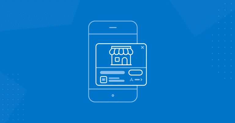
Ever since last year’s iOS 14 update, Apple users have been able to access App Clips from their mobile devices. App Clips are limited versions of apps that users can engage without downloading the full versions of these apps, and according to Apple, they’re “discoverable at the moment [they’re] needed.”
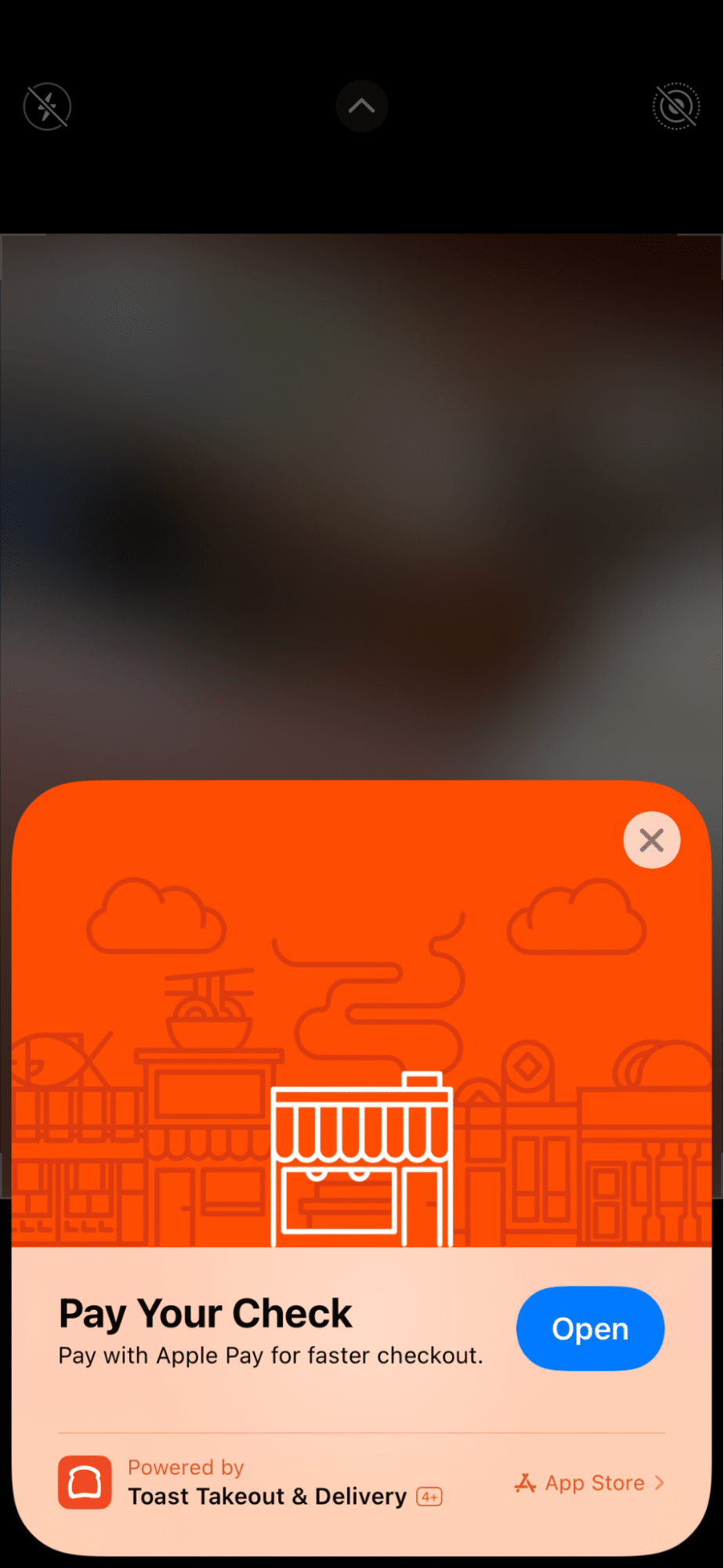
What does that mean? Maybe you’re paying for a meal (like in our examples) or looking up a location on a map, and maybe a specific app will help you complete your next action. Even if you don’t have the app installed, a limited version of it that can assist you — the App Clip — will make itself known via a pop-up banner card. For developers, it’s the card that will ultimately determine whether the App Clip gets used.
How Do App Clips Work?
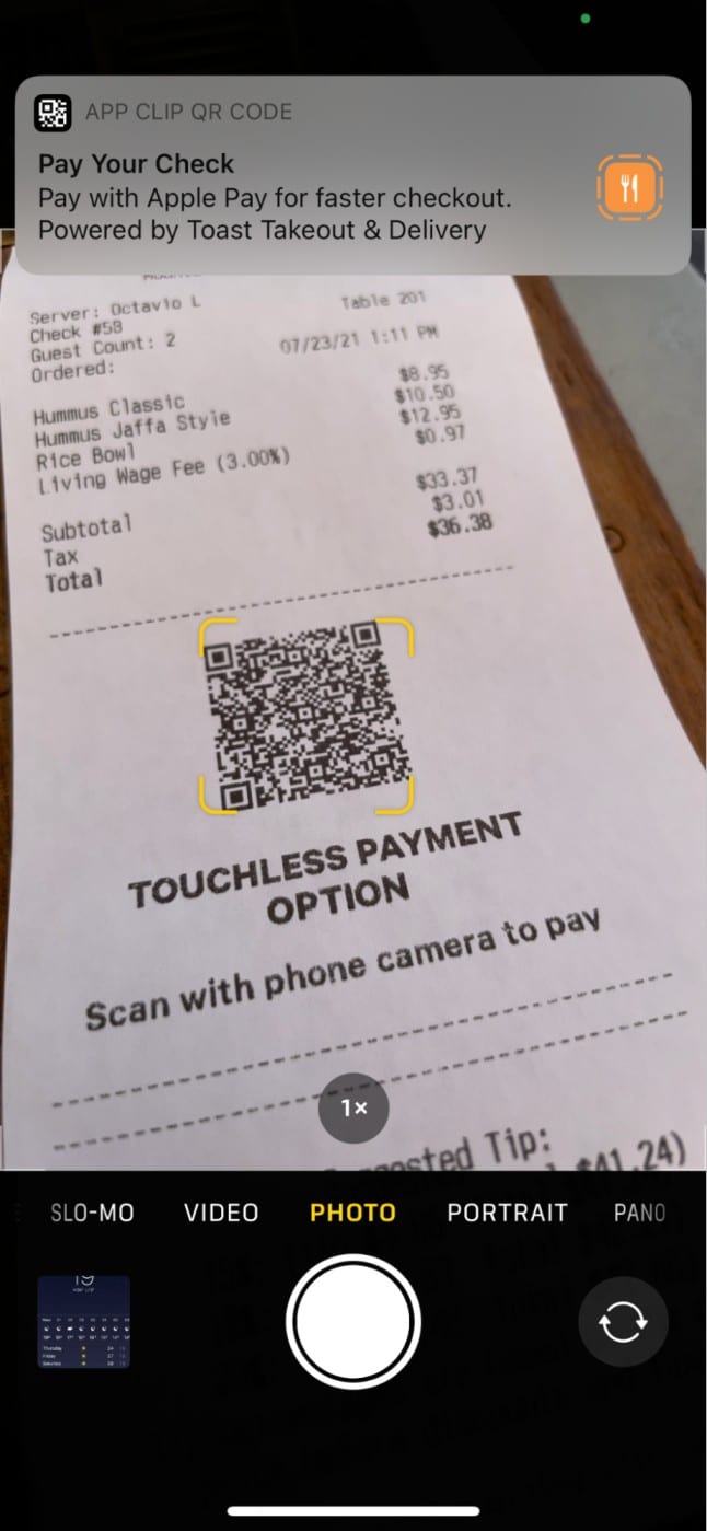
App Clips make use of pop-up cards designed to capture users’ attention and guide them toward the truncated versions of apps. A card will typically appear when a user takes a specific action with which an App Clip is designed to help. These actions include scanning a QR code, accessing an NFC tag, clicking a text message or, as of the upcoming iOS 15, visiting a website associated with a specific App Clip.
Companies can create their own App Clips in order to give their customers a smoother experience. As detailed by CNET, Panera Bread is one of these companies. Panera’s App Clip allows users to pay for food using Apple Pay, which is standard for App Clips. In addition, Panera’s App Clip is an information resource — users can see menus and find specific restaurant locations, for instance.
Fashion app The Yes is another example of an app that uses App Clips to reach a greater audience. App users can create “Yes Lists” — the equivalent of wish lists — and share them via text with non-users who will only need the App Clip to view them. If they click the text link, The Yes’s App Clip card will appear. These users can then access the App Clip and purchase Yes List items as gifts using Apple Pay — and all without downloading an app.

How to Create Successful App Clips
Since App Clips are meant to be abridged versions of apps, it’s important that they only contain an app’s most essential features. One such feature is payment — App Clips have assisted in preventing a physical transfer of cash or credit cards during the pandemic. Using Apple Pay, you can pay for goods or services without jeopardizing your health.
There are other features that App Clips can include in order to create a convenient and fulfilling experience for a customer. For example, games can use App Clips to share tutorials and let users start playing. App Clips for event-based businesses can not only sell tickets, but also make reservations or reserve parking.
Ultimately, it’s up to the developer to offer services that make an App Clip worth using. These services should be intrinsically tied to a company’s business, but also easy for the customer to execute. Finding that balance will mean that an App Clip is truly worth using.
How App Clips Attract Users
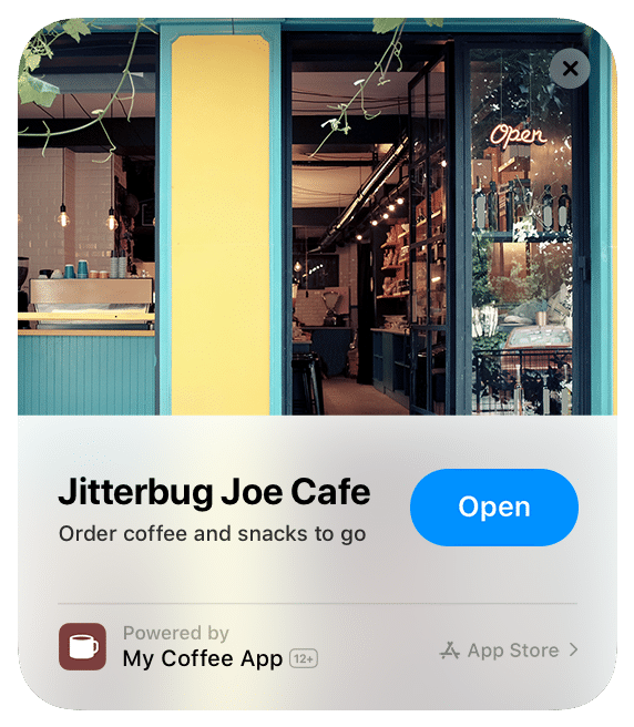
An App Clip card is a user’s only exposure to your app prior to opening the App Clip. This means that the card will determine the user’s next action. In order to get the best results, your App Clip card should not only be eye-catching, but also informative.
Apple has created a list of instructions for creating App Clip cards that they believe offer the best user experience. App Clip cards must use 1800×1200 pixel JPG or PNG files and they should not include text or in-app screenshots. Below the image, the copy should be concise (titles are limited to 30 letters, subtitles 56) but informative. New users should be able to understand how your App Clip will help them just by reading the App Clip card.
What Are the Limitations of App Clips?
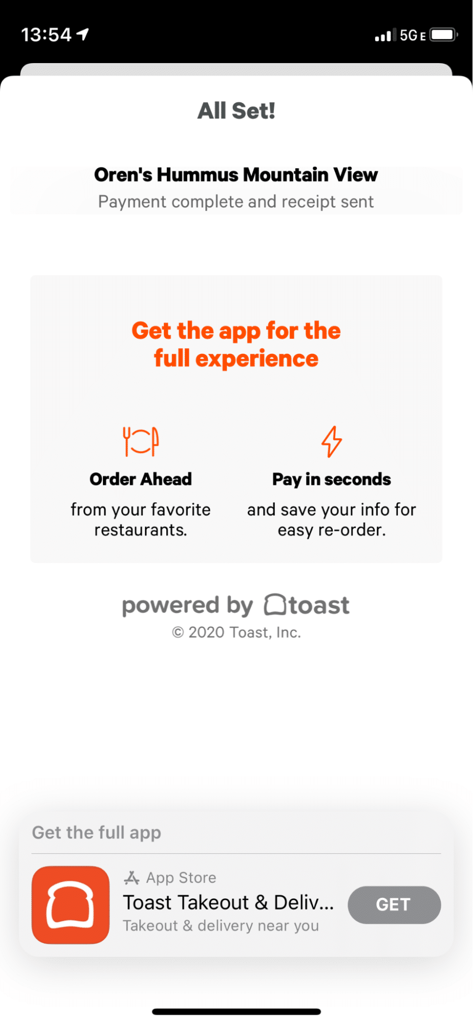
App Clips are a convenient way to use an app’s most popular features, when needed, without downloading the app. Nevertheless, an app clip is, by its very nature, limited in terms of what it offers. Customers who need an app for its less popular or more complicated uses will find that an App Clip doesn’t get the job done. They’ll have to download the complete app.
Restrictions and instructions around App Clip cards may make it harder for developers to “sell” their services — for instance, if an App Clip lets users do more than just place orders or pay for items, the card designer will have a difficult time conveying its capabilities in 56 characters.
Likewise, one static image may not give a user the full scope of what an App Clip can do. This is especially important considering that the user came across the App Clip when trying to complete a specific task (such as making a payment) — a personalized graphic referencing that task would be more likely to engage a user.
For developers who want users to download their apps, Branch’s Journeys product provides the personalized experience that App Clips can’t match. With Journeys, potential app users are shown a customizable smart banner that allows developers to share more information about their offerings. Users who already have the apps in question will be taken to the right in-app pages seamlessly.
Conclusion
Since App Clips appear to all iOS users — not just those who have downloaded the apps in question — apps that use them are in a position to reach many new potential customers. This makes an App Clip something of a “first impression” — it’s what a new user will see, and it will ultimately be met with judgment, either positive (a full app download) or negative (disuse).
While Branch’s Journeys offers a different experience than App Clips do, Branch still provides support for App Clips — both in terms of a smooth experience navigating them and in collecting attribution and analytical data from them. Contact Branch’s sales team to learn more about how Branch can help you with your App Clips or with advanced use cases for Journeys.

