CMOs, CTOs, marketers, and product managers alike are facing a challenge: How to drive high-quality app installs and top last year’s revenue numbers.
Here’s the challenge: For most brands, this requires the perfect balance of paid and organic efforts. Paid advertising has historically been relied on to drive a high volume of installs, but costs and competition for that channel have been steadily increasing.
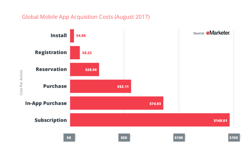
And in reality, organic channels can deliver high-quality installs for your dollars — as long as you offer a cross-platform experience that delights users and drives conversions.
Let’s take a look at the numbers. If you’ve read Branch’s Industry Report, you already know that organic channels like the mobile web can be up to 4.4X more effective at driving purchases than paid advertising.
Beyond our own research, SEOMoz and Enquisite found “the [revenue] opportunity from organic search is 5.66x that of paid search.”
Bottom line: Brands that combine the high-intent of organic search traffic with seamless mobile experiences position themselves for higher ROI than those clinging to paid channels alone.
The challenge: Creating a seamless experience that drives organic mobile users into your app. That’s where implementing personalized mobile interstitials and banners can separate you from your competition.
But before we dive into implementation, let’s take a look at what mobile interstitials and banners are — and how you can use them.
What Is A Mobile Interstitial?
Mobile interstitials are ads that take over an entire phone screen, while mobile banners are ads that take over a section of the phone screen. These ads are most often used during transitions between platforms (i.e. mobile web to app), or within natural breaks in app usage for promotions.
Ads like this encourage users to download or open an app from the mobile web. To offer the best experience, users should be deep linked into the app or directed to the app store if they don’t already have the app installed.
Here’s an example of how a full-screen interstitial displays on a mobile:
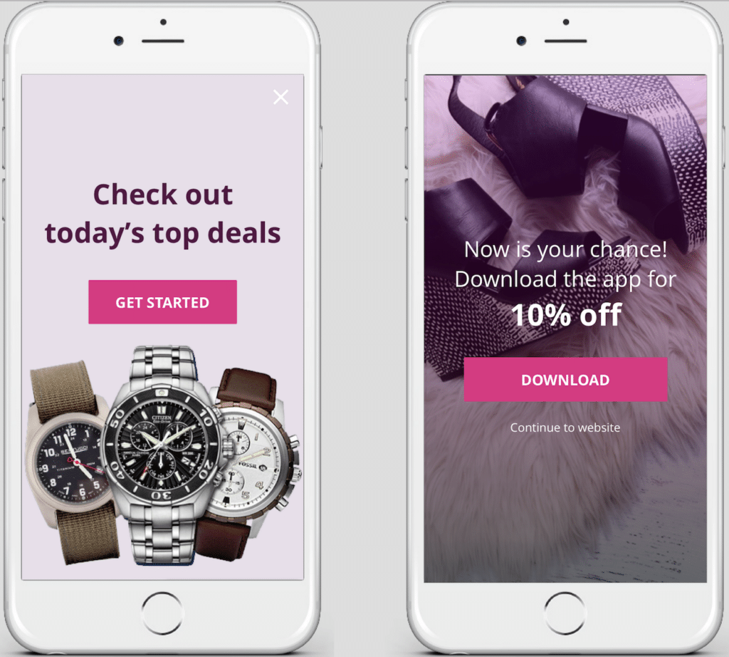
As you can see in the example above, testing offers and CTAs within interstitials can help you drive incremental lift.
What Is A Mobile Banner – And How Is It Different From An Interstitial?
Mobile banners can be implemented in a variety of sizes (half-page, 3/4 page, standard banner size), and can be positioned at the top or bottom of the screen. At Branch, we call these Journeys’ Smart Banners (more on that below).
The key difference between mobile interstitials and banners is size: Interstitials are typically full-page takeovers, while banners can take on a range of sizes (standard, 3/4, and half-page banners, etc.).
In the examples below, mobile banners at the bottom (left) and top (right) of the mobile website prompt users to download the app.
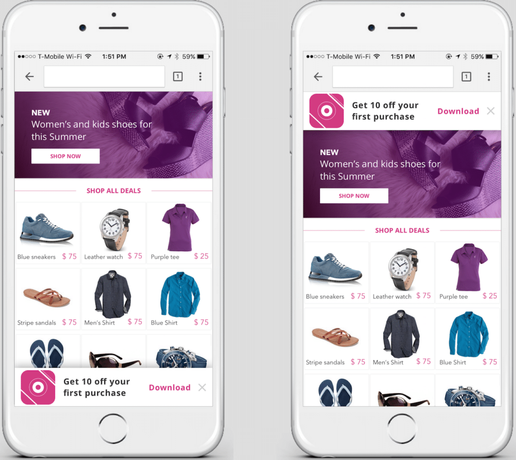
Testing the placement of mobile banners – at the bottom of your mobile website or the top – using Branch’s Journeys can help you test and iterate to drive lift.
In both cases, these banners should deep link users seamlessly from the mobile web into the app in order to ensure users who found you through high-intent organic search receive the best possible experience – and convert.
The Challenges of Implementing Interstitial Ads and Banners on Mobile
Of course, there are a number of ways you can create and implement interstitial ads and banners on mobile.
Building Your Own Interstitials and Banners
You can build your own interstitials and banners. There are three big challenges with this approach.
First, ensuring your interstitials and banners work on every device and deep link every user to the app without fail can be difficult.
Solving for both iOS and Android, and addressing every edge case, can take up a solid chunk of time. This approach also requires you to stay up to date on any changes in penalties from Google and ensure your solutions are in compliance. All told, it’s a much bigger lift than simply building and implementing a few full-screen takeovers. That’s why developers love us. (We helped Strava reduce in-house development time by 10x.)
Second, and perhaps most crucial, homemade interstitials and banners are difficult to customize and personalize.
Often, homemade interstitials and banners are static, lacking the ability to respond to the context of users. And that has a huge impact on numbers. According to Branch data, personalized, dynamic web-to-app banners are 2x more effective at driving app installs than static banners. The good news: Using Journeys, you can quickly A/B test everything from messaging to creative to deploying localized languages for your campaigns.
The third drawback: Creating personalized interstitials and banners in-house means to depend on your engineering team for multiple changes and iterations, adding time and complexity to that can lead to delays, increased development hours, and slower campaign launches.
Apple and Google Smart Banners
You could leverage Apple and Google’s Smart Banners. These options are solid, but there are a few challenges.
First, these options don’t offer full-screen interstitials. Preconfigured banner sizes are your only option.
Second, these banners are static, so the ability to personalize the creative messaging and design in response to users’ interest is limited.
Another challenge: Attribution can be more limited through these options, making it difficult for marketers to understand the full impact of their campaigns.
That’s where using Journeys truly pays off. Since our attribution is full-funnel, you’ll know exactly how users made their way from search to your mobile website and into your app.
Journeys Turns Organic Traffic Into Installs and Conversions
Of course, we’re a little biased, but we’ve seen today’s biggest mobile brands drive incredible results using Journeys.
Here’s why: Journeys allows you to drive users from organic search and your mobile website directly into your app – and accurately attribute their installs and conversions to the right sources and campaigns.
Even better? Journeys offers customizable templates that can be created and edited by anyone on your team in minutes. Now, you can quickly and easily A/B test messaging, creative, and button styles to figure out what works for your users and prospects to drive ROI.
This flexibility takes the pressure off of your engineering team, and puts the power back in the hands of product marketers, mobile marketers – all while delivering full-funnel attribution you can trust.
How to Create Mobile Interstitials and Banners Using Journeys
To get started with Journeys, you’ll first want to implement the Branch SDK. You’ll want to do that sooner rather than later for optimal Journeys performance.
Here’s how. First, you’ll want to add the code below somewhere inside the <head></head> tags on your website.
 <script type="text/javascript">
(function(b,r,a,n,c,h,_,s,d,k){if(!b[n]||!b[n]._q){for(;s<_.length;)c(h,_[s++]);d=r.createElement(a);d.async=1;d.src="https://cdn.branch.io/branch-latest.min.js";k=r.getElementsByTagName(a)[0];k.parentNode.insertBefore(d,k);b[n]=h}})(window,document,"script","branch",function(b,r){b[r]=function(){b._q.push([r,arguments])}},{_q:[],_v:1},"addListener applyCode autoAppIndex banner closeBanner closeJourney creditHistory credits data deepview deepviewCta first getCode init link logout redeem referrals removeListener sendSMS setBranchViewData setIdentity track validateCode trackCommerceEvent logEvent disableTracking".split(" "), 0);
branch.init('YOUR-BRANCH-KEY');
</script>
Note: You’ll need to replace YOUR-BRANCH-KEY with your Branch Key inside the init() call. You can find your Branch Key on the Dashboard’s Settings page.
Once you have the Branch SDK integrated into your website and app, you’re eligible to purchase Journeys and start creating your own dynamic mobile interstitials and banners. You can find out more about the technical implementation over in our Branch Docs.
How TBS Uses Journeys to Drive and Attribute Installs
Now, let’s take a look at how Journeys is helping one of America’s most popular television stations, TBS, drive 10X more installs from its organic traffic.
TBS noticed it had a high level of organic mobile web traffic. However, those users would receive a better experience streaming programs within the station apps.
So TBS turned to Branch to bridge their mobile web and app experiences.
In the example below, leveraging Journeys’ dynamic mobile web technology, TBS is able to prompt mobile web users to install the TBS app using a pill button. Of course, this design choice works well for their brand, but your interstitials and banners can be more classic or innovative, depending on the experience you want to deliver.
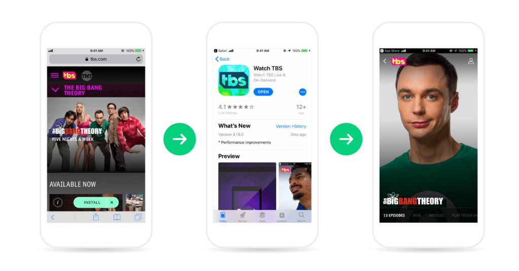
Users that have the TBS app installed are seamlessly delivered to the app to view programming, while those users that don’t have the app installed are delivered into the appropriate app store and prompted to download the app.
Using the mobile web to drive interested users into the app has resulted in a 10X increase in view-to-install rates for TBS.
Even better? Using Branch, TBS is able to personalize the experience and ensure users are delivered into the same programming they were interested in from first click to in-app viewing.
Ready to find out how Branch can help you master mobile banners? We’ll have another blog post this week on how to track your installs from mobile banners.
In the meantime, feel free to sign up for the Branch dashboard, or contact our sales team to find out more about how Branch can help you drive results like these.

